Mattel Packaging Internship
I was fortunate enough to be part of the Interns of Mattel Class of 2021, where I spent the summer working full time as an Action Figures Packaging Design Intern. I worked specifically on the WWE and Master’s of the Universe teams, where I created pack out designs for upcoming Summer Slam figures, as well as the logo for the New Eternia line of action figures that was released the following year.
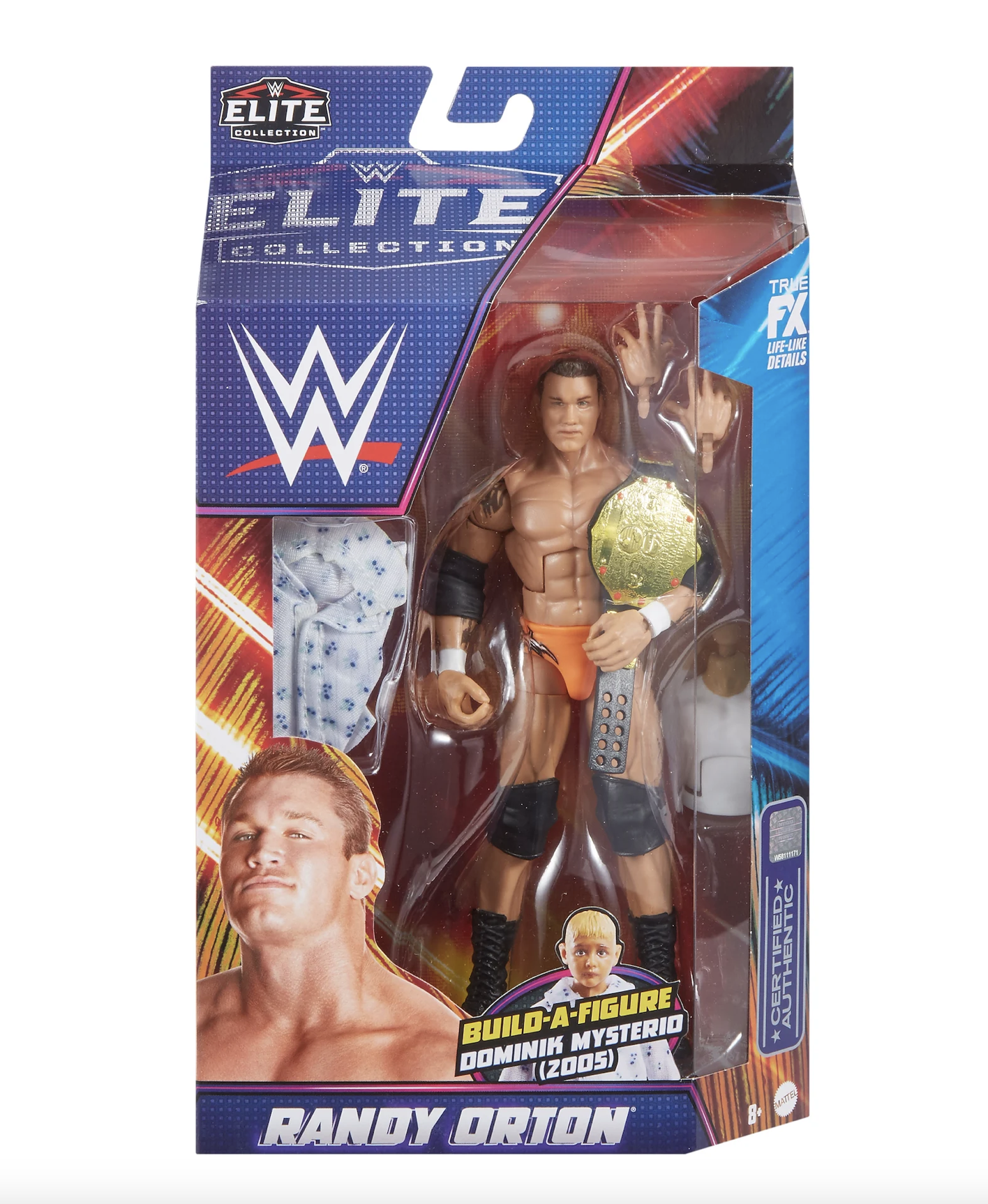
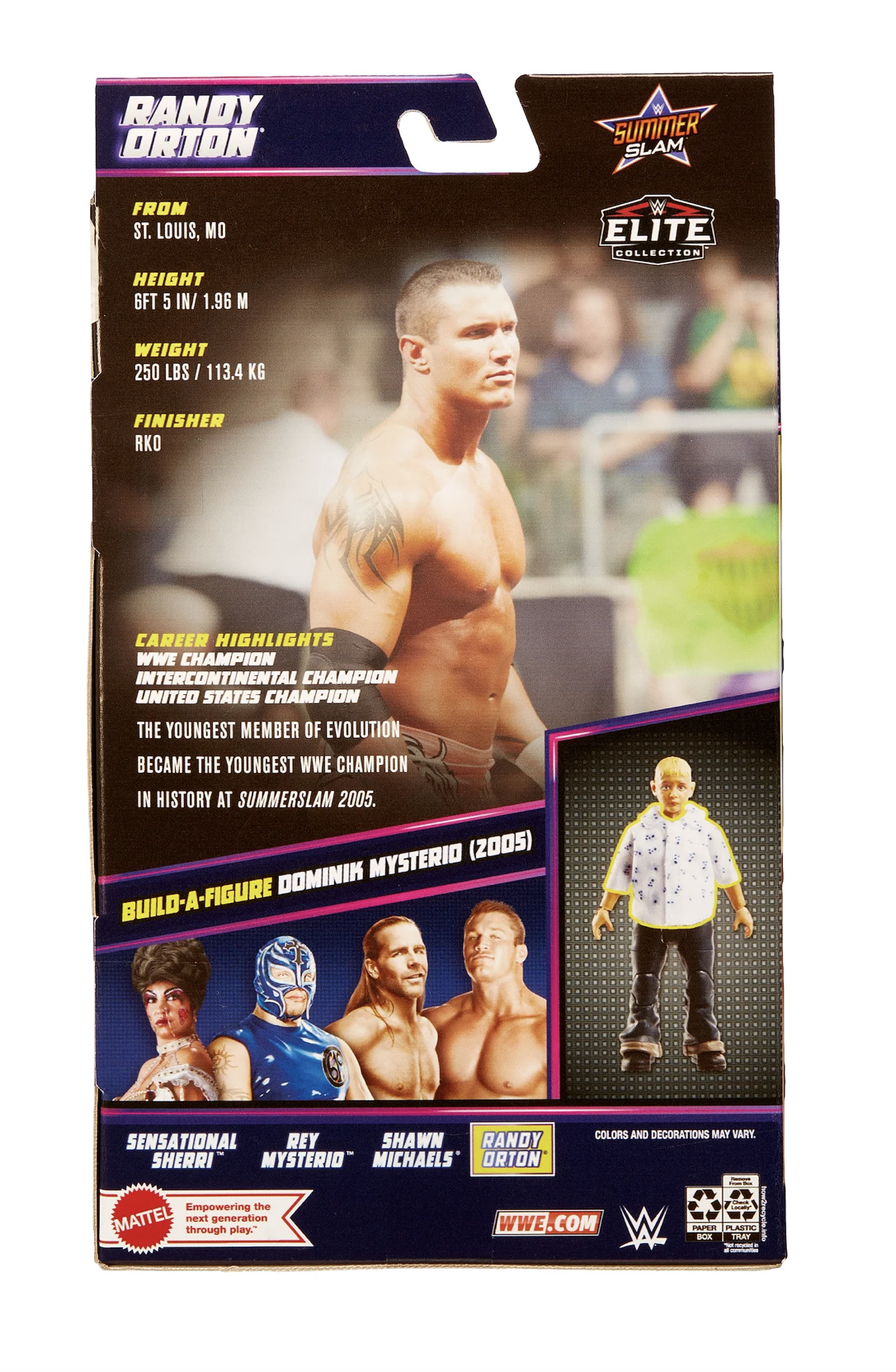
WWE Summer slam Figures
My main intern project was designing the pack outs for the upcoming 2021 WWE Summer Slam action figures of the year. I worked with the lead designer for WWE throughout the entire summer on this project to create the final design. The 2021 Summer Slam was held in Las Vegas, Nevada, so we really wanted to capture the essence of Vegas in the design. We opted for neon lights and strobes, bright colors, and palm tree textures.
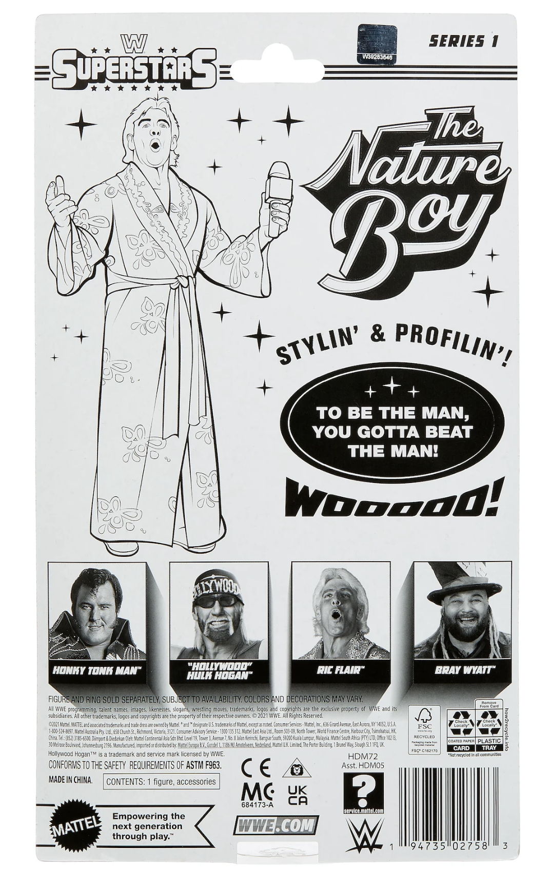
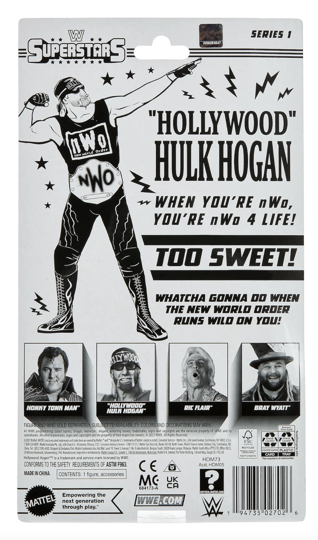
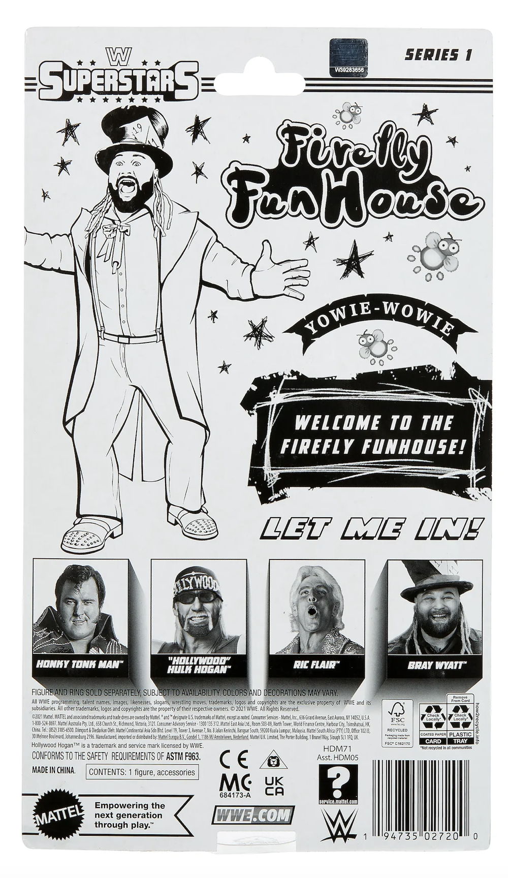
WWE Retro Back Panels
My first project as an intern on the WWE side, was designing the back panels for a retro figure line. I researched each of these Superstars to get a feel of the vibe of their wrestling persona, so I was able to incorporate elements into the panel design that highlighted that. An interesting part of this project was the back panels were in black and white; this challenged me to play with texture and the balance of white space rather than relying on a color palette. Elements such as the stars and scratchy effects on the Yowie-Wowie design, were hand drawn on my tablet and added into the file Adobe Photoshop.
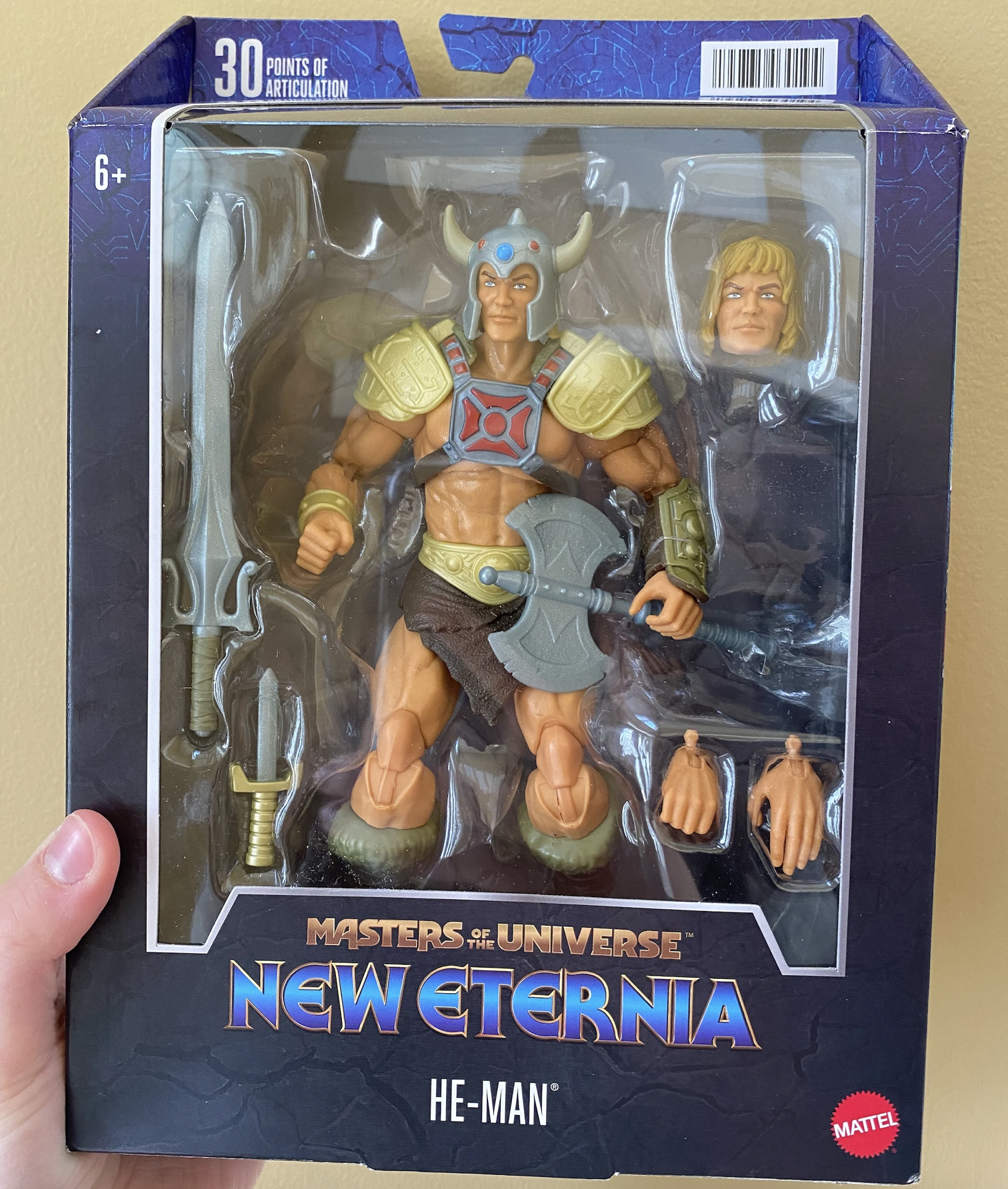
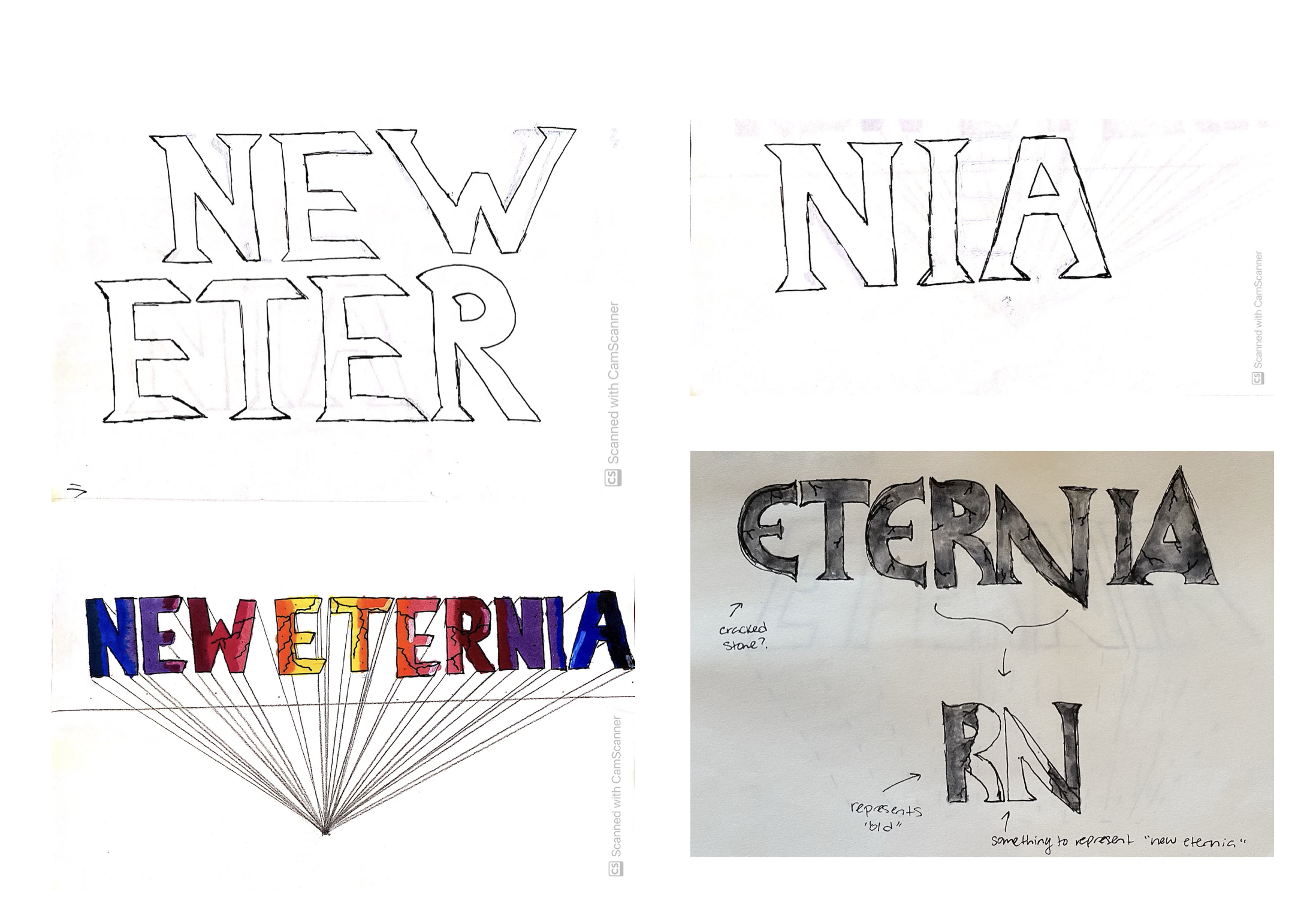
MOTU New Eternia Logo
My final project of my internship with Mattel was designing the logo for the upcoming New Eternia line of Masters of the Universe figures that was dropping the following year. This was my favorite project that I worked on because I was given a lot of creative freedom in the logo design process, and was able to lead some of the efforts of communicating with Mattel’s overseas production counterparts during the editing process.
For the design, I took inspiration from the original New Eternia logo, and wanted to incorporate as many elements as possible into the modern day version. The main design element that I took inspiration from was the medieval-looking typeface that the vintage logo used. I hand drew my own version, incorporating text effects and a fitting color palette that turned into the final logo design. Below you will see my hand sketches, and the final printed pack out once the line hit shelves.